

What Is a Type Scale? Heading Sizes, Line Height and Line Length
Setting heading and text sizes with a ratio instead of guesswork: modular scales, line height, ideal line length and fluid type sizes.
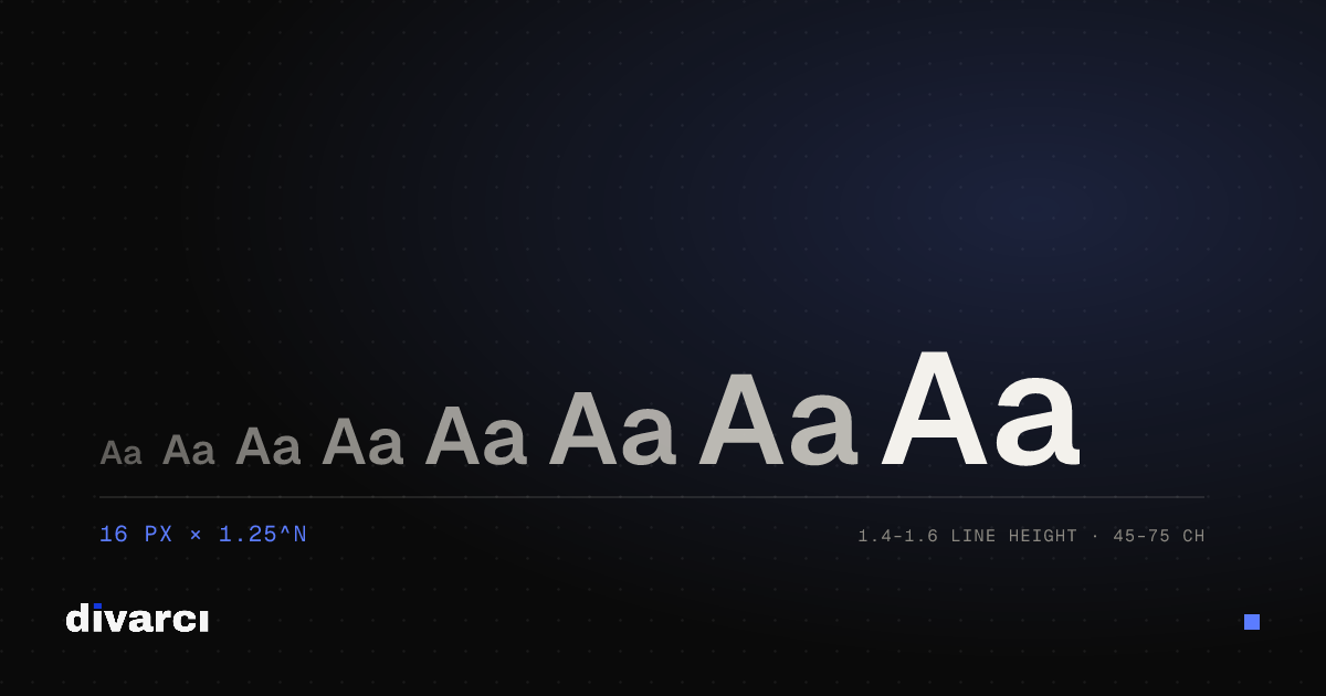
When heading and text sizes on a page are picked at random, the relationships between them look inconsistent: some headings sit too close to body text, others are oversized. A type scale ties these sizes to a single ratio and gives the page order and rhythm.
How a modular scale works
You choose a base size (usually 16 pixels on the web), and each step up is the previous one multiplied by a ratio. With a ratio of 1.25, for example: 16 → 20 → 25 → 31.25 → 39 pixels.
Common ratios
| Ratio | Value | Character |
|---|---|---|
| Minor second | 1.067 | Very tight; dense interfaces |
| Major second | 1.125 | Calm, small steps |
| Minor third | 1.2 | Balanced; most websites |
| Major third | 1.25 | Clear hierarchy |
| Perfect fourth | 1.333 | Strong headings |
| Augmented fourth | 1.414 | Dramatic |
| Perfect fifth | 1.5 | Very strong contrast |
| Golden ratio | 1.618 | Editorial, large headlines |
A common approach is a smaller ratio on small screens and a larger one on wide screens. Large ratios make headings too big on phones.
Line height
- Body text: about 1.4–1.6 times the font size reads comfortably.
- Headings: line height should shrink as size grows; 1.1–1.25 is usually enough for large headings.
Line length
On very long lines the eye struggles to find the start of the next line; very short lines make reading choppy. For body text, about 45–75 characters per line is recommended. Giving the text block a max width such as 60–70ch in CSS achieves this.
rem instead of pixels
Defining font sizes in rem respects the default font size the reader has set in their browser. In a browser with the default 16 pixels, 1rem equals 16 pixels.
Fluid type sizes
The CSS clamp() function lets a font size grow smoothly with the screen width between a minimum and a maximum. You get proportional headings on every screen without writing separate breakpoints for mobile and desktop.
Practical tips
- Don't set body text below 16 pixels on mobile.
- 5–6 steps of the scale are enough for most projects.
- Build hierarchy with weight and spacing, not size alone.
With the Type Scale Calculator you can pick a base size and ratio, get every step in px, rem and fluid clamp() values, and preview them with your own text. For free fonts that support Turkish characters, see the Turkish Character Font Finder.
More posts
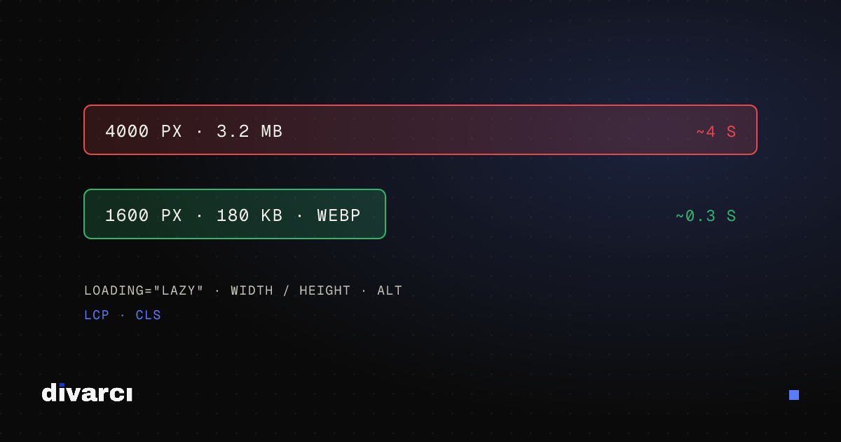
Optimizing Images for Websites: A Guide to Faster Pages
Prepare your website images with the right size, format and compression so pages load faster and perform better in search.
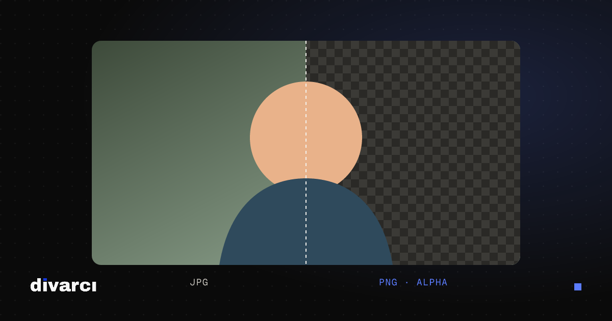
How to Remove a Photo Background: A Practical Guide to Transparent PNGs
Shooting tips for clean background removal, edge settings, manual touch-ups and saving a transparent image in the right format.
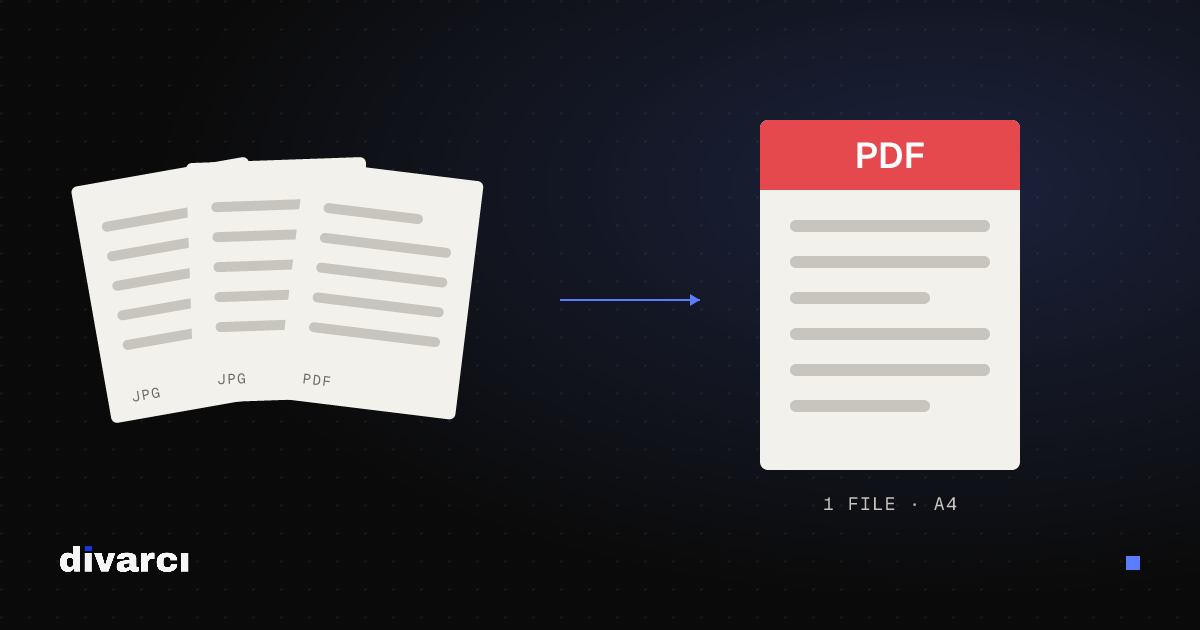
Putting Documents into One PDF: Photos to PDF, Merging and Splitting
Turning documents photographed with a phone into a PDF, merging several PDFs and removing pages you don't need, for applications, email or archiving.