

Color Contrast and Legibility: How to Read WCAG Ratios
What the contrast ratio between text and background means, what the WCAG AA and AAA thresholds stand for, and how to choose legible color pairs.
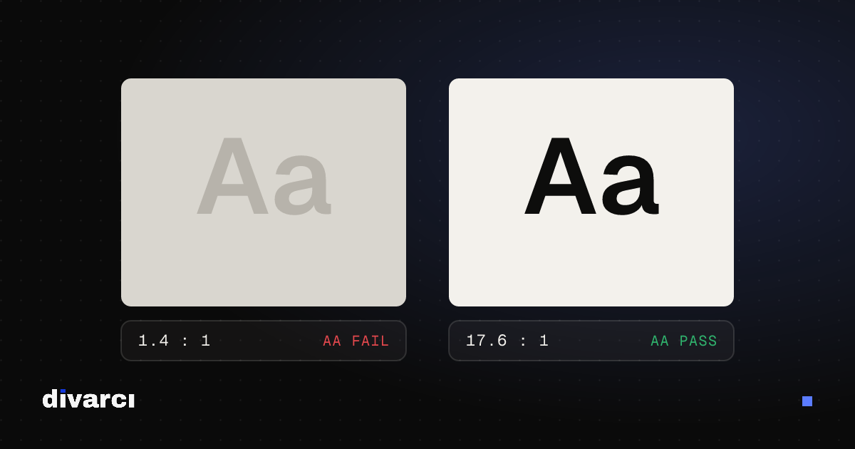
A color pair that looks good isn't always legible. White text on light gray, or black text on dark blue, may pass on a designer's screen, but for someone reading a phone in the sun or with low vision, the text disappears. The contrast ratio turns that difference into a number.
What is a contrast ratio?
The contrast ratio compares the relative luminance of two colors and ranges from 1:1 to 21:1. 1:1 means two identical colors (no difference); 21:1 is black on white (the maximum). The higher the ratio, the easier the text is to read.
WCAG thresholds
The Web Content Accessibility Guidelines (WCAG) define two levels for text:
| Level | Normal text | Large text |
|---|---|---|
| AA (recommended minimum) | 4.5:1 | 3:1 |
| AAA (enhanced) | 7:1 | 4.5:1 |
Large text means roughly 24 px (18 pt) and larger at regular weight, or roughly 18.7 px (14 pt) and larger in bold. Non-text interface elements that carry meaning, such as button borders, form fields and icons, should reach at least 3:1.
Common mistakes
- Light gray text: Light grays chosen for a clean look often fall below 4.5:1.
- Text on photos: Light and dark areas of the photo change behind the text, so parts of it become unreadable. A semi-transparent dark overlay or a solid box behind the text fixes this.
- Relying on color alone: A note like "red fields are required" doesn't work for people with color vision deficiency; add a symbol or text as well.
- Using the brand color for all text: A vivid brand color can work for large headings but fall short for small body text.
Choosing legible pairs
- Pick the text and background colors.
- Measure the ratio; aim for at least 4.5:1 for body text.
- If it's too low, change lightness rather than hue: darkening the text or lightening the background raises contrast while keeping the color's character.
- Check the result on a phone and in bright light, too.
Measure the contrast ratio and WCAG AA/AAA result for any two colors with the Color Contrast Checker, and build balanced palettes with the Color Palette Generator.
More posts
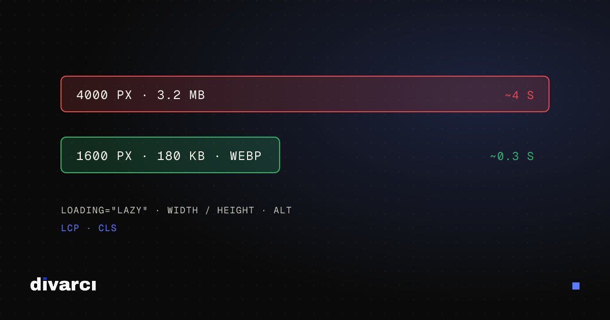
Optimizing Images for Websites: A Guide to Faster Pages
Prepare your website images with the right size, format and compression so pages load faster and perform better in search.
How to Remove a Photo Background: A Practical Guide to Transparent PNGs
Shooting tips for clean background removal, edge settings, manual touch-ups and saving a transparent image in the right format.
Putting Documents into One PDF: Photos to PDF, Merging and Splitting
Turning documents photographed with a phone into a PDF, merging several PDFs and removing pages you don't need, for applications, email or archiving.