

How to Build a Color Palette: Color Harmonies and the 60-30-10 Rule
Analogous, complementary and triadic harmonies, the 60-30-10 rule, the role of neutrals and a step-by-step way to build a balanced palette.
One of the biggest reasons a design looks "put together" at first glance is a limited, consistent color palette. A social media feed or website that uses different shades on every screen looks messy, however good the content.
Color harmonies
These color groups work together based on their positions on the color wheel:
| Harmony | How it's chosen | Effect |
|---|---|---|
| Monochromatic | Light and dark shades of one color | Calm, elegant, consistent |
| Analogous | 2–4 colors next to each other | Soft, natural transitions |
| Complementary | Two colors opposite each other | Strong contrast, eye-catching |
| Split complementary | A color and the two neighbors of its complement | Contrasting but more balanced |
| Triadic | Three evenly spaced colors | Vivid and energetic |
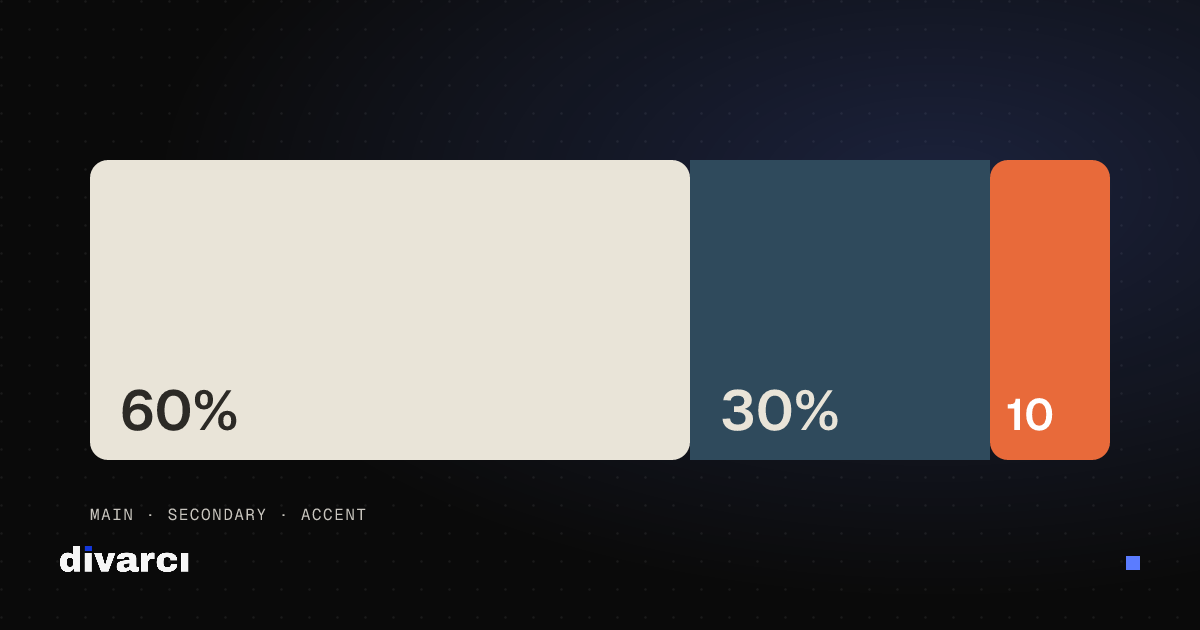
The 60-30-10 rule
Instead of using colors in equal amounts, build a hierarchy:
- 60% main color: usually a neutral or calm tone; backgrounds and large areas.
- 30% secondary color: supports the main color; cards, sections, secondary elements.
- 10% accent color: the most vivid color; buttons, links and anything that needs attention.
An accent used sparingly has more impact. When everything is highlighted, nothing stands out.
Don't forget neutrals
Palettes are usually imagined as vivid colors, but most of a design is carried by whites, blacks and grays. Slightly warm or cool neutrals instead of pure black and white sit better with the rest of the palette.
Building a palette step by step
- Pick a starting color: your brand color, the dominant color of a photo or a tone that fits the project's mood.
- Choose a harmony: analogous or monochromatic for calm, complementary to stand out.
- Keep it short: for most projects, 1 main, 1–2 supporting and 1 accent color plus neutrals are enough.
- Make a shade scale for each color: you'll need lighter and darker shades for hover states, backgrounds and borders.
- Check contrast: make sure every color pair you'll use for text is legible.
Pulling a palette from a photo
The colors of a photo you like are a good starting point, because colors in nature and in well-shot photos are already balanced.
The site's tools cover each step. The Color Palette Generator builds palettes from harmony rules and lets you lock the colors you like. The Image Color Palette Extractor finds a photo's dominant colors. The Color Shades Generator makes an 11-step scale for any color, and the Color Contrast Checker measures legibility.
More posts
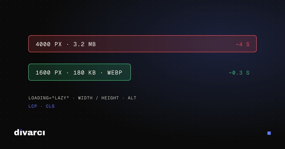
Optimizing Images for Websites: A Guide to Faster Pages
Prepare your website images with the right size, format and compression so pages load faster and perform better in search.
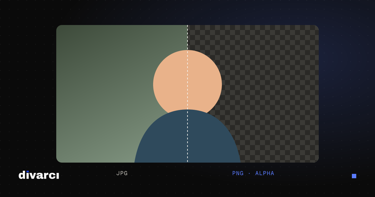
How to Remove a Photo Background: A Practical Guide to Transparent PNGs
Shooting tips for clean background removal, edge settings, manual touch-ups and saving a transparent image in the right format.
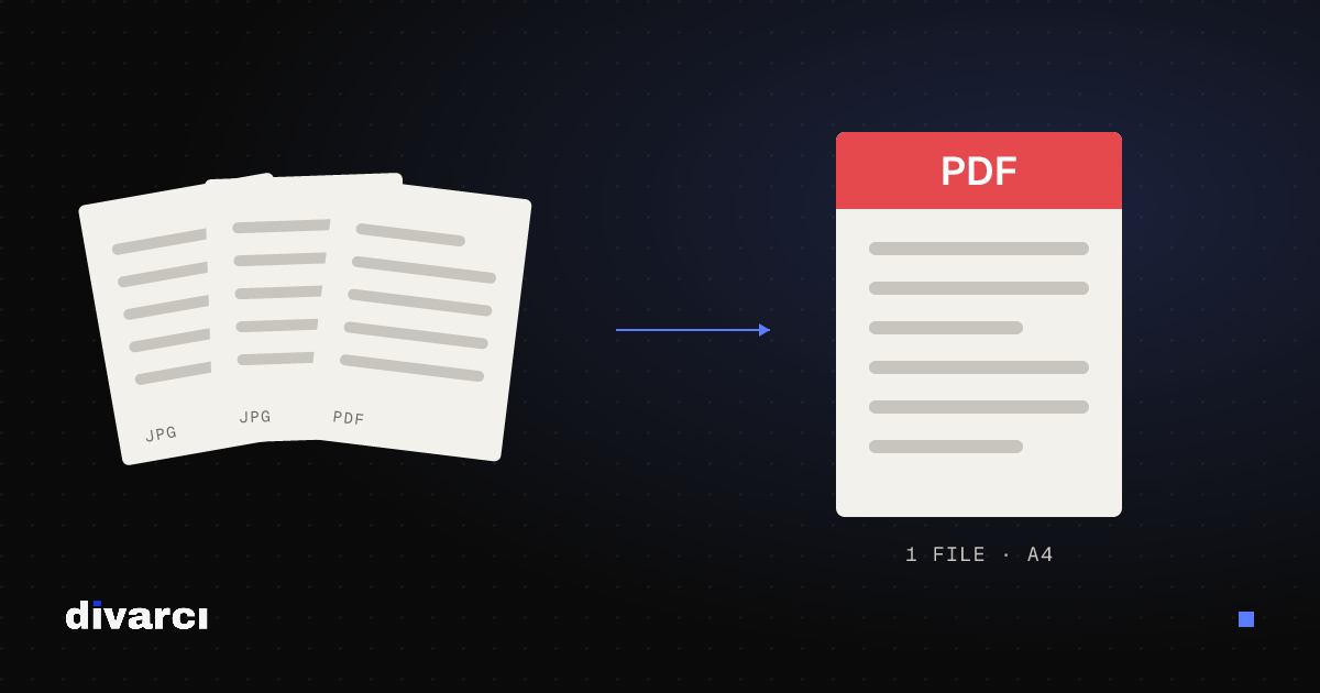
Putting Documents into One PDF: Photos to PDF, Merging and Splitting
Turning documents photographed with a phone into a PDF, merging several PDFs and removing pages you don't need, for applications, email or archiving.